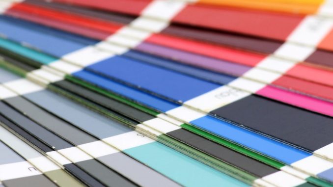
Blue = mellow. Black = serious. Red = bold.
Whether it’s intentional or not, humans associate colors with specific feelings and emotions. Colors influence how we perceive people, places, things, and brands. This phenomenon is often referred to as color psychology, or the study of colors in relation to human behavior.
When picking the colors for your company’s logo and brand elements, it’s important to research what feelings and emotions are naturally evoked with the colors you’re using. The use of a specific color can help you portray your brand in a way you want to be perceived without you having to do any of the work.
Before you decide what colors you want to use for your logo and other brand elements, check out our list of color descriptions below. By picking the right colors, you’ll be able to automatically influence consumer perception.
When you think blue, you think calm, cool, and collected. Blue evokes feelings of trust and stability, making it a perfect fit for our Tribe partners at R.S. Merit.
Red is a color that’s often associated with feelings of boldness and passion. Brands like Target, Coca Cola, and Red Bull have used different shades of red to portray exuberance, optimism, and excitement to consumers.
If you’re looking to elicit feelings of growth, freshness, or renewal, green is the way to go. We used green when creating the logo for our partners at Innovation Triangle, the world’s foremost innovation and technology center.
Yellow
Warmth, happiness, and clarity are all feelings associated with the color yellow. McDonalds, Ikea, and Ferrari have capitalized on the happy feelings associated with yellow to represent their brand.
Purple is often viewed as a color of royalty and power, making it perfect for our partners at Cornice & Cobble. If you’re aiming to come off as wise, noble, and luxurious, pick purple.
