Email marketing comes with a world of potential. It’s inexpensive, easy to segment and instantly reaches hundreds, if not tens of thousands of individuals with just a few clicks. Store owners have been using email marketing to drive traffic to their products, blog, and product videos. Not to mention, in terms of return on investment, few other advertising methods match the capability of email marketing. However, to ensure emails attract the key demographic, it’s necessary to incorporate a handful of design tips. Here are several e-commerce email marketing design tips to increase sales.
Go Mobile
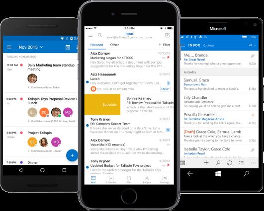
One of the most important design features every single company needs to utilize is designing for mobile screens. Gone are the days where most emails are viewed over a desktop. In fact, more emails are viewed on smartphones and tablets than traditional computer screens.
All of this means an email marketing campaign needs to look good on a mobile device. If the recipient is forced to pinch, zoom and scroll throughout the email they become less likely to not only read the current message but may avoid reading future correspondence.
To maximize the potential of email marketing, all messages must be mobile friendly. Otherwise, it alienates far too many potential customers.

(Source)
Subject Line
The subject line may be the most important information included in any email marketing campaign. Without a quality subject line, customers won’t open the message and email service providers may sift the message over to the spam folder.
The best way to create a quality subject line is to provide a solution to a customer’s problems. This can be anything from looking good in the latest fashion trends to unclogging the shower. All products offer a service and every service addresses a customer issue. It’s all about identifying this issue. Once the issue is identified the subject line needs to indicate how a product will address the issue.

(Source)
Cut Down on HTML Content
More is not always better. In fact, more within an email may end up hindering its impact on a customer. In fact, according to HubSpot, additional HTML content reduces viewership of an email by 23 percent.
Why does more HTML content hurt email potential? For starters, some email service providers filter out heavy HTML material. It may send it either to the “Promotions” tab, or the dreaded “Spam” folder. Either way, this lowers readership.
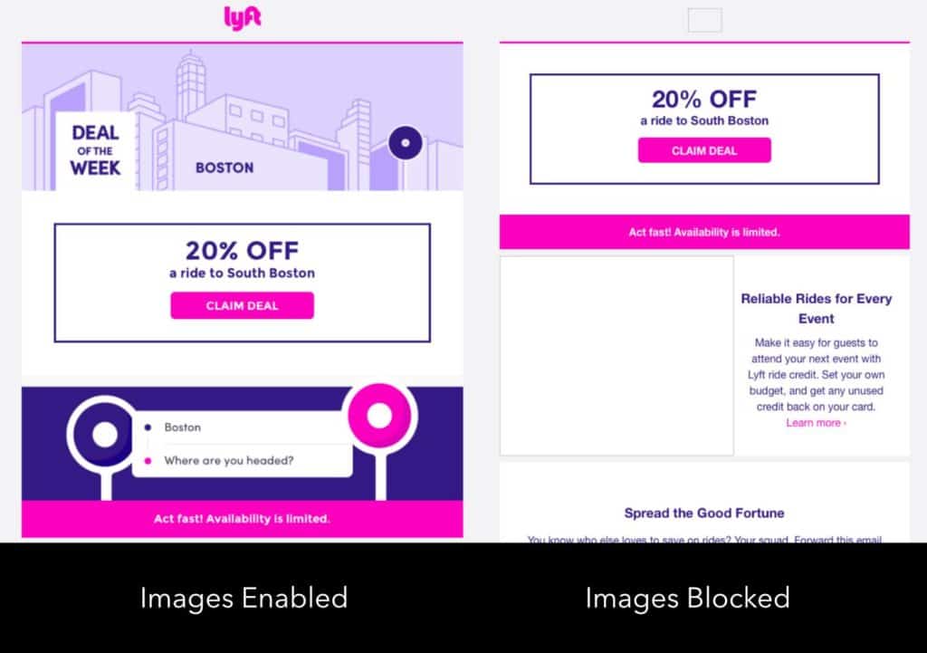
Emails containing large amounts of graphics do not always load properly. Over a slow Internet connection, the message may not load at all, or it will take far too long to load at all. Other email services block out images, so if valuable information comes within an HTML visual, the recipient might not even see the content at all.
There’s nothing wrong with using HTML, it just needs to be streamlined. By lightening the coding-load, it helps deliver a fast opening email without being flagged by the email service provider.

(Source)
Using an Email Template? Choose the Right One
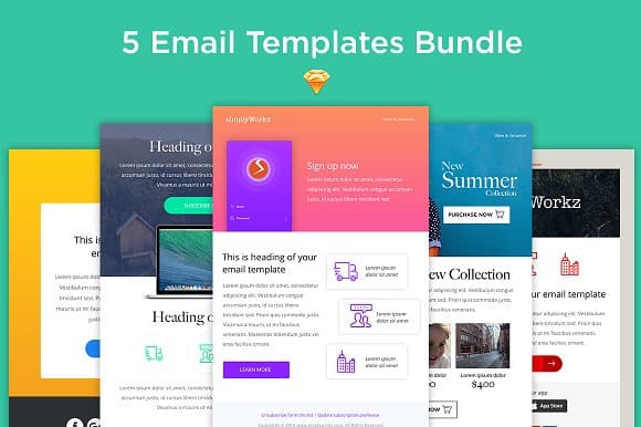
Email templates make it easy to produce a message and send it out without dealing with editing the content and constantly shifting the format. To write the perfect email template does require knowledge of copywriting. Whether this is created in-house or downloaded from a service provider, there are all sorts of template options. This is where knowing the right template makes a big difference.
According to Email on Acid, the best template is a single column no wider than 600 pixels. Why? The biggest reason is it helps with the mobile design factor. It reduces the need to constantly shift and alter the display. It also looks good on any screen dimension. With so many different screen sizes out there, it’s important to have a design that looks good on all.
On top of this, a width of around 600 pixels keeps the visuals to a set size and helps prevent it from bogging download time. Most professional email service providers offer a template for meeting these characteristics.
Additionally, it’s important to use a standardized text. The text should be clear and easy to use. While the specially designed text has a time and a place, it needs to load correctly in an email. If a computer or Internet browser does not understand a given font, it won’t always load correctly.

(Source)
Follow a Brand Design
An email recipient should know exactly whom a message is from when they open it up. To do this, all emails should contain some basic similarities. This doesn’t only include the template but also the color scheme and overall setup. By branding the email, an email recipient will become comfortable with not only what to expect, but also where to find certain information within the confines of the message.
Keep the Message Short
Emails should not turn into long-form blog posts. If the desire of an email is to connect a recipient with a blog post, the best course of action is simply to provide a short blurb and follow-up link for where to read the rest of the message.
According to Constant Contact, emails should have no more than 200 words. In fact, less is almost always more in this instance. With fewer words and blocks of text, the valuable information and visuals draw the attention of the viewer.
Within the email, the text should include a to the point headline, quick sales tips and a call to action. Anything more and it runs the risk of becoming too wordy, which may impact the possibility of an email recipient clicking on provided links.

(Source)
Is it Easy to Scan?
The one column format helps with this. However, it is very important for an email recipient to easily scan the contents without necessarily reading everything. Should they find the information they like, they have the opportunity to read more on it. However, if there are large blocks of text or too many images, it slows the viewer down, which in turn leads to scannability issues. If the reader is unable to take away the general purpose of the email right away, it’s necessary to edit the email.
In Conclusion
Email marketing, when done right, has the ability to drastically increase sales and bring the target audience to the company’s website. However, in order to make sure the email campaign performs as well as possible, it needs to utilize these design tips. The combination of proper email segmenting, drip marketing and design wrapped into one campaign may just become the most valuable advertising method in a company’s repertoire.

Leave a Reply