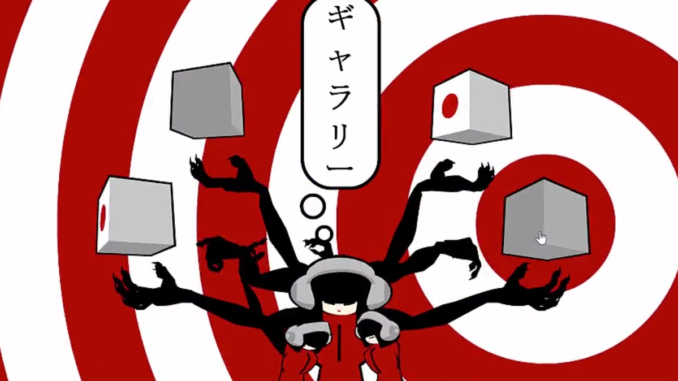
These days, our web browsers—whether on mobile or desktop—are highly functional and can do all sorts of things that we could only dream of a decade prior.
But despite that, one could argue that the web has actually gotten less creative over time, not more. This interpretation of events is a key underpinning of (Taschen, $50), a new visual-heavy book from author Rob Ford and editor Julius Wiedemann that does something that hasn’t been done on the broader internet in quite a long time: It praises the use of Flash as a creative tool, rather than a bloated malware vessel, and laments the ways that visual convention, technical shifts, and walled gardens have started to rein in much of this unvarnished creativity.
This is a realm where small agencies supporting big brands, creative experimenters with nothing to lose, and teenage hobbyists could stand out simply by being willing to try something risky. It was a canvas with a built-in distribution model. What wasn’t to like, besides a whole host of malware?
The 640-page book, full of pictures of interactive websites from prior eras, benefits from taking a wide view of the visual culture of the past: Starting at the embryonic stages of the World Wide Web, it follows the art of web design through periods of extreme experimentation on the way to the convention-driven scaffolding we have today. The book makes a compelling case through its general structure that the sweet spot of creative web design came during the late 1990s through the mid-2000s—periods in which major brands were willing to invest a whole lot of money in a website intended for show, not just tell.
Ford, who is known for running the long-running Favourite Web Awards (FWA), is very much in the “show” category. In an email interview, Ford listed off a dizzying array of iconic websites, pages that once wowed the broader internet and helped uncover key design mechanisms—for example, Ford says 1998’s EYE4U, an early influence on many Flash developers, “showed us responsive design 15 years before the term was coined,” while sites like 2002’s Who’s We Studios and 2003’s tokyoplastic brought personality to the equation.
There was a lot of it because of the artistic influences these creators brought forth. “It’s worth noting how many super-creative talents have a ’background‘ in rave and club culture, whether that be as punters or promoters,” Ford said.
These sites, reliant on animation and Flash’s underlying ActionScript language, were the kind that excited creatives, ready to embrace an artistic medium, but frustrated usability experts, who would rail against the way the sites flouted basic convention.
If any one website sort of hits these two tensions perfectly, it’s Subservient Chicken, the popular Burger King-produced web interactive which hits right in the middle of the nearly three-decade period covered in this book. At the time of its creation, it was widely discussed and dissected by advertisers who realized that its combination of visuals and ELIZA-style text commands represented something new. Given the move towards chatbots and memetic videos in the years since, it feels downright predictive.
“Subservient Chicken gave us something we hadn’t experienced before, that was real time (even though it actually wasn’t real time, it faked it very well) interaction but, more importantly, an emotional ‘live’ personal experience,” Ford notes, adding that it also predicted voice assistants that work in similar ways.
But the aggressive creativity offered by Flash eventually would prove impossible to bring to the mobile era in quite the same way, as portability and improved HTML rendering capabilities made it obsolete. Around the time of Steve Jobs’ famous open letter to Adobe, Ford noted that many of the Flash era’s creators “completely moved away from the web and used their talents elsewhere.” There were still some notable HTML5-based creations during this period—including the Arcade Fire’s Google Chrome “experiment” “The Wilderness Downtown,” which Ford calls “the biggest, most influential website in over a decade.” But the social era—particularly Facebook Pages—proved “a final nail in the coffin for web design,” he noted.
But all those wild ideas had to go somewhere, and many of them didn’t appear in the App Store. Ford says that while the modern web has largely eschewed the creative risks of the Flash era, it can be found in physical mediums and augmented reality, places where many of the creative explosions that web tools like Flash and HTML5 initially allowed can be furthered and built upon—with many of the same creators behind the initial rise responsible for much of the modern excitement.
“The progressive interaction and visual creativity is happening outside of the web browser now,” he explained. “The rise in interactive installations, AR, and experiential in general is where the excitement of the early days is finally happening again.”
This book, which hits next month, comes just at a time when Flash—a tool first developed by FutureWave, then improved upon by Macromedia and exploited on a mass scale by Adobe—is about to meet its maker, and the internet has moved past it for perfectly sensible reasons. (Seriously, Flash is hacked all to hell and you probably should avoid it in most circumstances.)
While a book may be static rather than interactive, this feels like a fitting coda for a kind of digital creativity that—like Geocities and MySpace pages, multimedia CD-ROMs, and Prodigy graphical interfaces before it—has faded in prominence. But when it was there, we needed it, because of all the creative folks it inspired.
“Without the rebels we’d still be looking at static websites with gray text and blue hyperlinks,” Ford said.

Leave a Reply