The Simple Method For Designing Attractive & Engaging Facebook Carousel Ads
How’s it going, everyone?
In today’s post, we’re going to discuss how to create Facebook carousel ads in Canva.
Let’s jump right in!
What Is A Facebook Carousel Ad?
According to Facebook, carousel ads are a type of ad format in which you can “showcase up to 10 images or videos within a single ad, each with its own link.”
When you design a Facebook carousel ad, you’ll want to use, ideally, a minimum of 5 images. And that will look like this on someone’s feed.
 3 Ways To Design Facebook Carousel Ads
There are 3 main ways to design this kind of ad graphic:
1. A graphic template repeated throughout the carousel, varying only in the main featured image/product.
In some cases, you may change up only the first image, so that you can features a headline, such as a sale announcement…
…or just anything that would be more eye catching.
The goal of this is to entice your viewer to scroll through to the next images of the carousel, which would feature individual products or services that you offer.
With a recurring template on your carousel, your ad will have a nice and uniform look.
2. A carousel of photos of your product or service with the details placed in the ad caption.
This one requires very minimal editing. All you need to do is crop or resize your images into the recommended square size.
It’s important that for this type of carousel ad, though, you have to use the best of the best of your product or service images.
They have to be crisp, and if they’re lifestyle images, they have to be staged well.
If you want to learn how to create quality product shots before you design Facebook carousel ads, then you can check out this post next.
3. A seamless or connecting carousel ad set.
This Facebook carousel ad design type is what we personally consider to be the most fun one to make.
These separate square images, once published on someone’s feed, will look like they’re connected to one another…
…cleverly using the carousel’s side scrolling function to your ad’s visual benefit.
Let’s go ahead and try making one.
How To Design A Connecting Carousel Ad: Step-By-Step Tutorial
Let’s start with setting up our Canva file.
On Canva’s homepage, click on the “create a design” button at the top right of the screen. Then click on “custom size.”
Since we’re creating 5 square images with each one being 1000×1000 pixels in size…
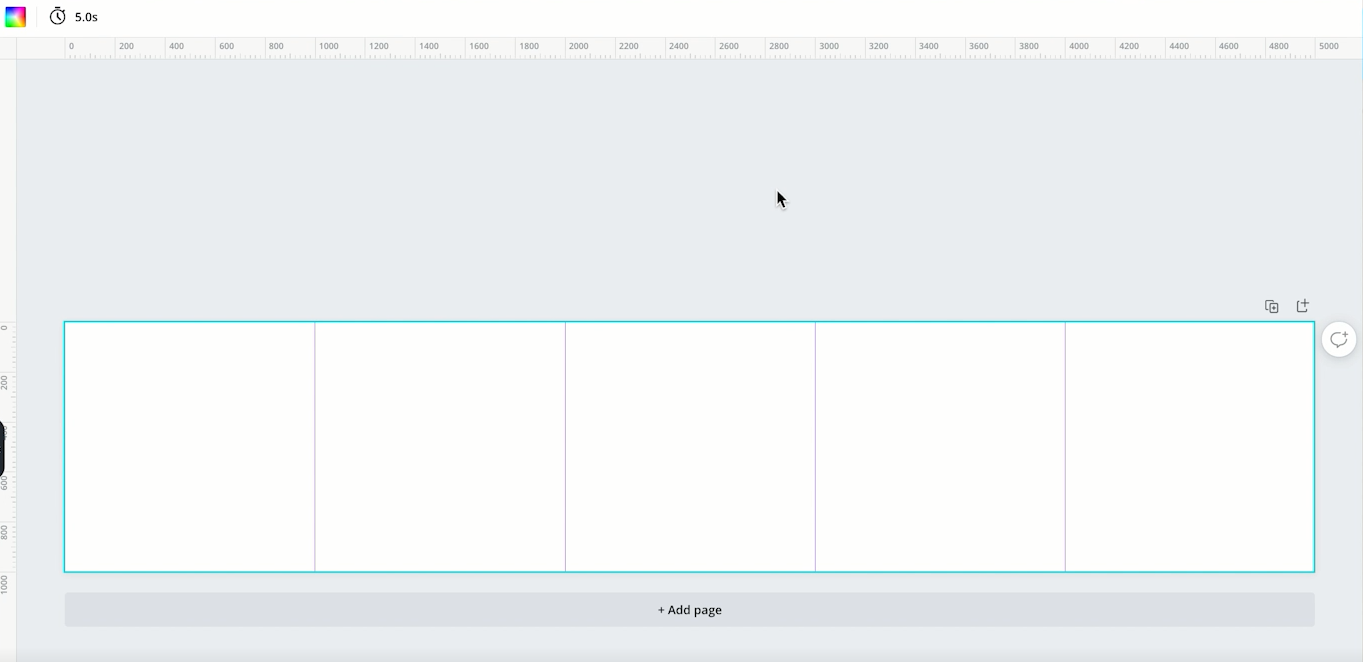
…we’re going to set up a canvas that’s 1000 pixels in height and 5000 pixels in width.
We’re going to design the carousel as one very wide image, and then we’re going to cut them into their individual squares after we’re done.
Before we start designing, we’re going to want to mark where each square begins and ends.
This is so we know exactly what elements we’re placing in each square.
We’re going to do that by clicking on “file” and then “show rulers.”
You’re going to see this ruler that’s set to pixels.
We’re going to add a ruler line to every thousand pixels, so we can easily identify the borders of each square ad once we’ve cut them.
 Now that we have our document set up, we’re ready to start designing.
You can start from scratch and play around with Canva’s library of elements and backgrounds.
Or if you look at the templates tab, you’ll notice a bunch of wide graphics pre-set templates.
You can use any of these as your starting point by keeping just the background and decorative elements…
…and you’ll already have a seamless design ready to add your product or service images to.
Just be sure to edit the colors and change a few elements to fit your visual branding better.
Once you’re happy with your design, go ahead and save the file as jpg or png.
We’re now ready to split our design into 5 individual images, and for that, we’re going to use the site pinetools.com.
Pinetools is a free website with a wide variety of digital tools, and for this guide, we’ll be using their split image tool.
Get Exclusive Marketing Tips!
From their home page, click on “more” in their images section. Once the page loads, scroll down and click on “split image.”
Once the page has loaded:
You can now click on “download zip file”.
Once that’s downloaded, unzip your file, and in that folder you’ll now have 5 separate (but visually connecting) graphics for your carousel ads.
 And that’s it for today’s design guide!
This is a simple method that anyone can do, and it can provide you with stunning Facebook carousel ads in no time.
Be sure to follow LYFE Marketing for more essential digital marketing guides and graphic design tips.
And if you’d like the help of a professional Facebook advertising agency, you can contact us here.
If you have any questions, please leave us a comment down below. Otherwise, that’s all we have for you today.
See you in the next post!

 3 Ways To Design Facebook Carousel Ads
Leave a Reply