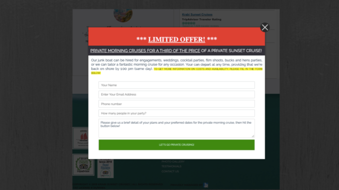
The last thing you want is your screen freezing as you try to close a ridiculous number of pop-ups with redundant, and sometimes, nonsense information. Sadly, when pop-ups first started being used, this was often the case. For this reason, any and all pop-ups since then have received a lot of criticism from consumers. However, when used effectively, pop-ups are a way to strengthen your digital marketing efforts with an average conversion rate of between 2% and 3%.
Pop-up No-Go’s
Before getting into which pop-ups you should be using and how, we wanted to cover a few things you need to stay away from when creating them.
- Having multiple pop-ups on a short page
- Giving irrelevant offers
- Being too wordy
- Asking for too many details when applying for offer
- Hiding the close button
- Using auto-play videos
Types of Effective Pop-ups for Digital Marketing
In order for pop-ups to be used effectively as a part of your digital marketing strategy, you need to know which kinds work. If you’re able to use one of the options below with strong copy and an interesting offer that’s shown at the right time, you’re set!
Exit Pop-ups
This is an effective pop-up when a potential customer is interested in what you’re offering, but is not yet ready to make a purchase.
These are normally big text boxes that pop up with the background blurred or darkened. The offer must be strong enough to keep someone who is ready to leave your site interested. Newsletter signups, discount codes (especially first time customer discounts) and free trials work very well as offers.
Click Pop-ups
This is one of the least intrusive pop-ups. You are able to showcase your products and go into detail without making it feel like a pop-up. Someone has to click on a product they are interested in and then additional information will pop up (i.e. tutorial video) on that specific product. Since they’ve already shown interest in learning more about the product the pop-up has a strong conversion rate when it does appear.
* The pop-up must be about the same product they’re looking at for this to work.
Opt-in Bars
These can drive a lot of attention to your offers as they are easily seen and not as intrusive. The benefit to using opt-in bars is that it can remain on the users’ screen as they scroll. Adding a countdown timer creates a sense of urgency that makes the conversion rate even higher. Deals and offers that work best for this are: active contests, ongoing offers and newsletter sign-ups.
* Do not use this if you need to include a lot of copy.
Interactive Pop-up
The most popular example would be a wheel that you can “spin” to win a reward (discount, free shipping, etc.) The spin only happens after the requested information has been filled out.
Another bonus is that you don’t have to worry about how much free stuff you may need to give away. You’ll be able to adjust the percentages for different prizes to control what is won.
Not all pop-ups are cringe-worthy. If you know what you’re doing it can elevate your digital marketing game and increase revenue. It all comes down to whether or not the offer is relevant and the pop-up is well-designed with good copy. Keep in mind that one small mistake can ruin a users’ experience, so if you’re unsure of how to create effective pop-ups get in touch with us for some help!
The post The Pros of Pop-ups for Digital Marketing appeared first on Blueprinted Marketing.
