Don’t Make These Website Mistakes
If you’re serious about digitalising your business and taking it “online” – then your website is going to make or break what you want to achieve.
In order to help you make sure your website is as good as possible, here are 9 mistakes to avoid with your website.
1) Not Optimised for Mobile
As you should know by now, it’s really important for your website to be optimised for mobile. Why? There are two main reasons.
Firstly, Google primarily indexes based on mobile performance, and by failing to optimise for mobile, you will damage your ranking in the search engine results.
Secondly, it’s been predicted that by this year, 2.5 billion website users will be using mobile. By not getting your site mobile-ready, you’re missing out on impressing these potential customers.
2) Loading…
As we mentioned recently, in today’s digital world, people want your website to be quick. If your website is slow, it’s going to be giving users a negative experience, and if you’re selling products online or hoping to generate leads through your website, it’s likely going to cost you money.
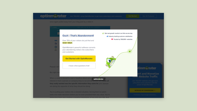
3) Excessive Popups
We’ve all experienced popups at some point, and while they may have once had a function in online advertising, they are typically regarded as intrusive and disruptive now. This is because online users have got smarter, and want to have a great user experience when they visit a website.
If you use pop-ups excessively, you’re likely going to annoy your users and force them to leave your website and visit another site. Google and Facebook have even taken steps to block them by default by encouraging the Coalition for Better Ads’ Better Ads Standards. Essentially, these outline what kind of ad creates a negative experience for users, which is used for filtering out bad ads.
4) What Do You Do?
It may seem obvious but if a user cannot identify what it is that you do within a few seconds, they’ll leave your website. It’s extremely frustrating for the user to be clicking around the website and delving deep into your copy to get a basic understanding of what you do.
If it’s not clear, they’ll leave, and you’ll miss out on potential customers.
5) You’re Not Secure!
If your website is vital to your business and if you process any sensitive personal information, it is imperative that you have an SSL certificate on your website.
What are they?
An SSL (Secure Sockets Layer) certificate digitally binds a cryptographic key to an organisation’s details. Essentially, it creates a secure link between your website and your users’ browsers, helping ensure that all information is going to the right place and can’t be stolen.
Why should you bother with this?
This will improve your customer’s trust as they are more likely to engage with a website that is considered secure. Google Chrome even alerts users that sites are not secure if they don’t have an SSL certificate, which has the potential to drive away customers.
Additionally, Google prioritises websites with SSL certificate in their search rankings, so by having one, you can get an SEO boost and drive more traffic to your website.
6) What Do We Do Next?
A call to action is a key part of your website that instructs the user what to do and encourages them to take an action. Here are some examples of calls to actions:
So why should you be using them?
Well, they help you engage the customer and they help the customer understand what to do next which pulls them further into your sales funnel. Without them, even the most engaged of customers may leave your website without ever interacting with you.
7) Bad images
Why?
If you use bad stock imagery, it can appear misleading and confuse the website user, eventually causing them to leave. Imagine if you use imagery that doesn’t relate to your written content or imagine if you use dated stock imagery. It’s going to cast doubt in your user’s mind and potentially prevent them from purchasing your products or getting in touch.
8) No Social
Despite what Lush would lead you to believe, the general consensus within the industry is that you should have social media accounts and feature links on your website. It’s a great way to begin building a solid audience and retaining website visitors with ease (assuming you maximise your presence and engage on the platform regularly!).
If you made it this far, there’s no excuse for making these mistakes. If you’re having a new website developed and going digital for the first time, make sure you don’t make these mistakes!
Need help getting your website started or marketed? Get in touch with our team to find out how we can help.
