
Data visualization is an ever-growing field that helps to communicate data in a more compelling and insightful way. The first example of data visualization was a pie chart in 1786 by William Playfair.
The field has come a long way since, then with the use of graphs, infographics, and even 3D data visualizations. Each new example allows for a more complex and accurate portrayal of data, which is essential in making sound decisions based on facts.
As data becomes more complex, it is more important than ever to use data visualization in order to see the bigger picture. This article explores seven types and examples of data visualization, and offers tips on selecting the right method for your digital marketing campaign.
Table of Contents:
7 Types and Examples of Data Visualization
In a nutshell, data visualization is the process of transforming data into a graphical representation. This can be used to help boost digital marketing campaigns by allowing marketers to see patterns and trends that would be difficult to identify from raw data.
There are many different types of data visualization, each with their own strengths and weaknesses. These methods can be used to make sense of data and to help communicate insights to others. Here are seven of the best data visualization examples:
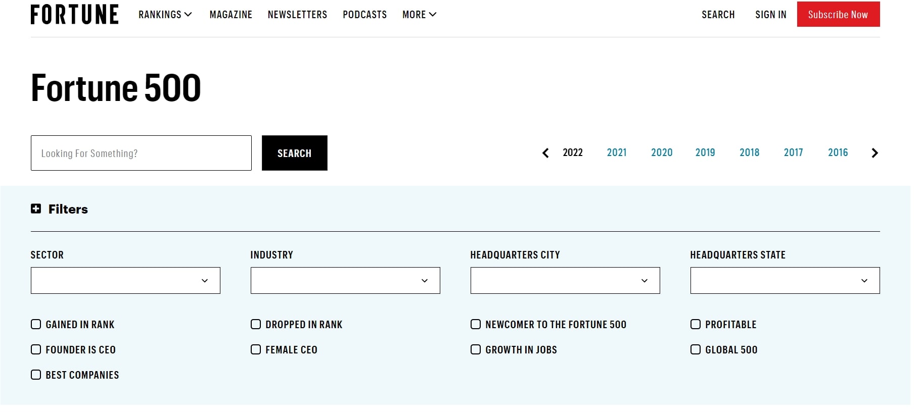
Tables
A table is one of the most common ways of displaying data. It arranges data in rows and columns to compare two data points using the same criteria. This method is great for turning complex data sets into a clean and simple visual that readers can easily digest.
For example, the table below shows a complete list of the Fortune 500 companies for 2022. With this visualization tool, you can easily see vital information such as their revenue, assets, market value, and other metrics. You also have the option to select which filters you want to compare for each company.
Charts
Charts are another great way to visually represent data in a concise manner. It allows you to illustrate trends based on complex data through diagrams and similar forms.
For example, pie charts are great for showing the relative proportions of a whole, while bar, charts work best for comparing values between different groups.
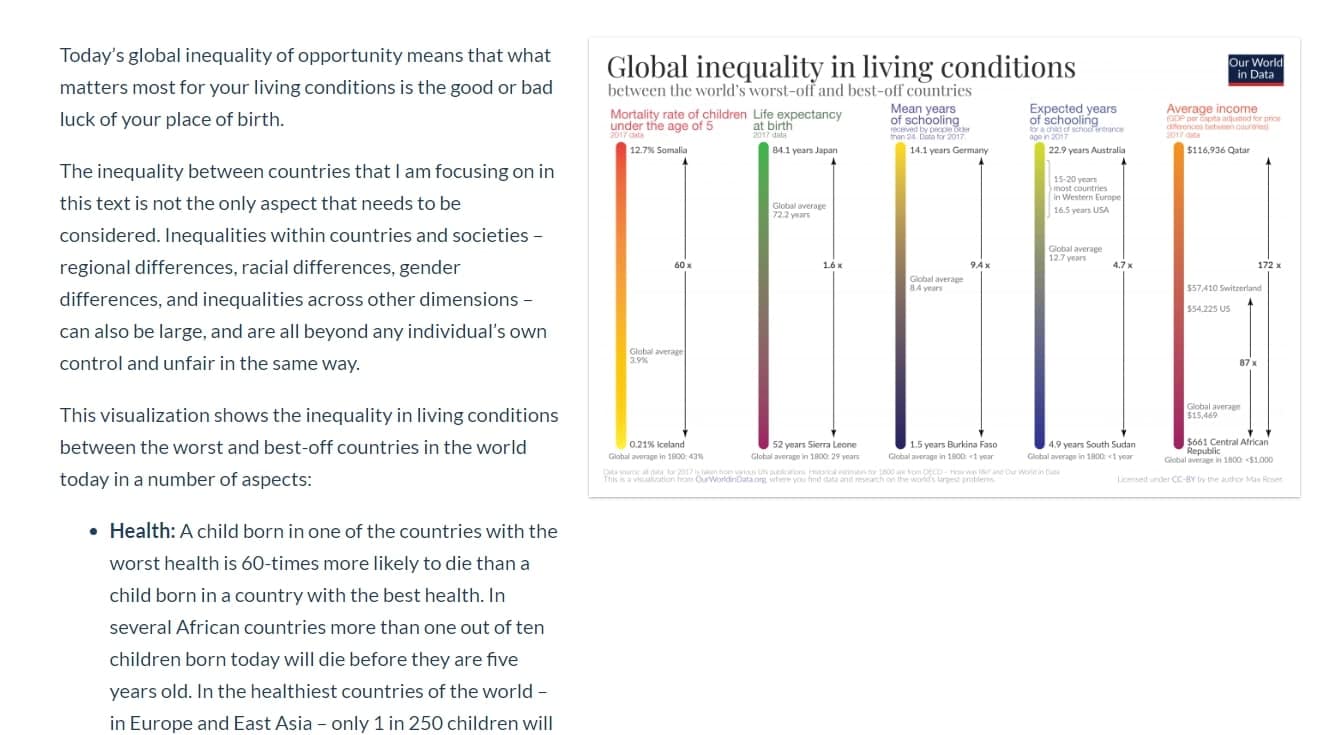
For example, the interactive charts from Our World in Data presents useful statistics about the global economic inequality, from the 1900s to the current millennium.
Hovering your cursor around allows you to look at the level of income percentages per year.
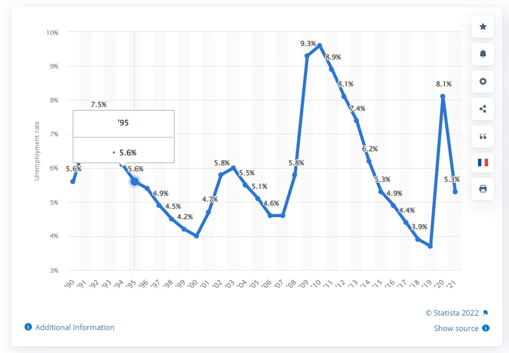
Graphs
Graphs utilize lines and segments to display data over time. By transforming raw data into visualization, they effectively show the relationship between two or more data points. Examples include histograms and scatter plots.
Histograms allow you to visualize the distribution of a variable. Meanwhile, scatter plots make it easier to investigate the relationships between different components.
To illustrate this, here’s a graph showing the unemployment rate in the United States from 1990 to 2021. This visual from Statista provides you a glimpse of how the rate has fluctuated over the years.
Venn Diagrams
Venn diagrams are useful for illustrating how different data sets overlap. With each variable represented by a circle, this diagram visualizes the similarities and differences between them in a way that your audience can easily understand.

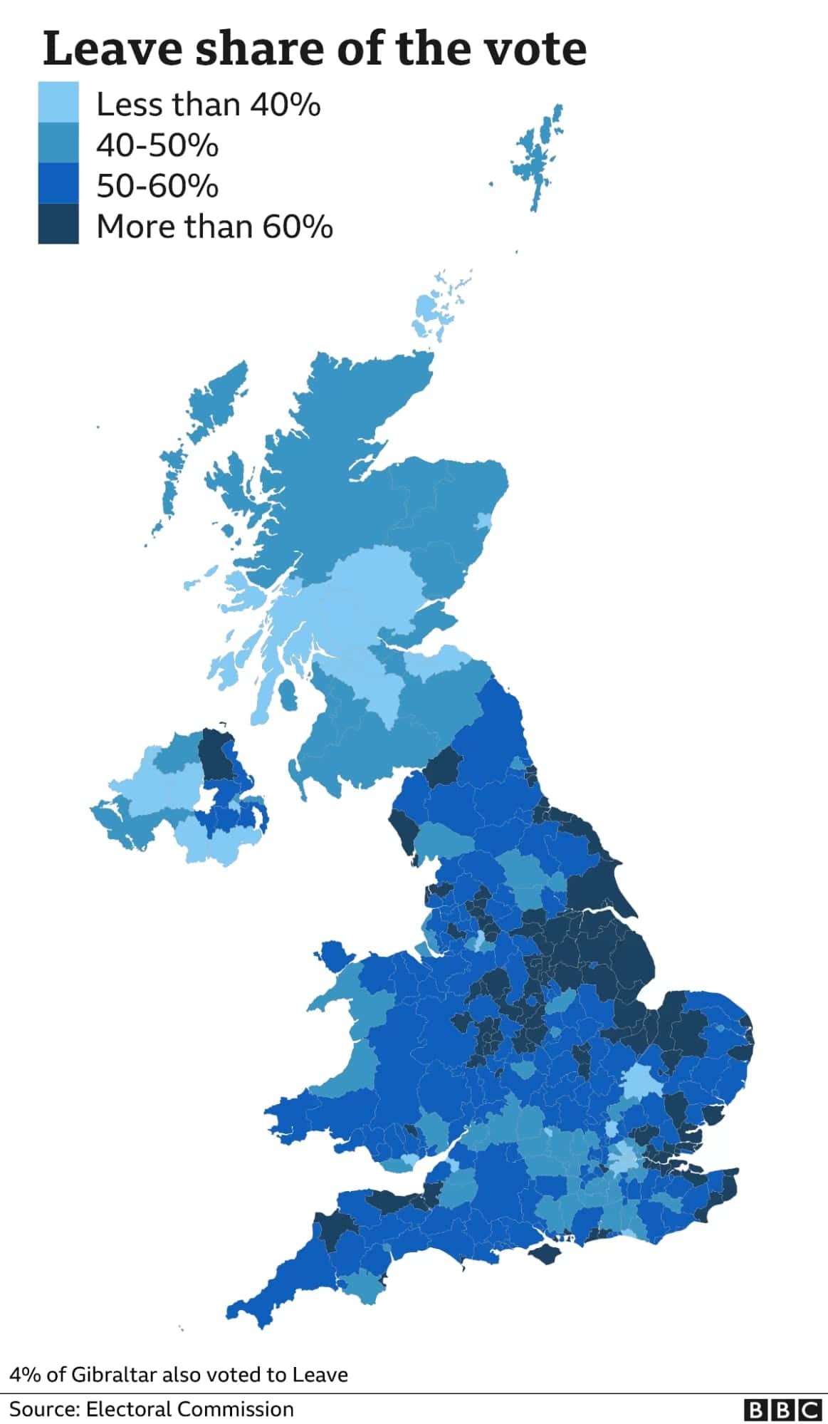
Maps
Maps are ideal for visualizing geographical data and plotting relationships between data points. For instance, a treemap enables you to illustrate the hierarchical structure of data.
As an example, this map from the BBC shows the results of the Brexit referendum. It allows you to see which regions voted to leave or remain in the European Union. It also visualizes the demographics of voters for each region in the United Kingdom.
Timelines
Timelines can be used to show how data changes over time. This is a great storytelling tool, as it highlights the sequence of events in a way that your target audience can easily follow. For instance, you can use a timeline to show how your company has grown over time.
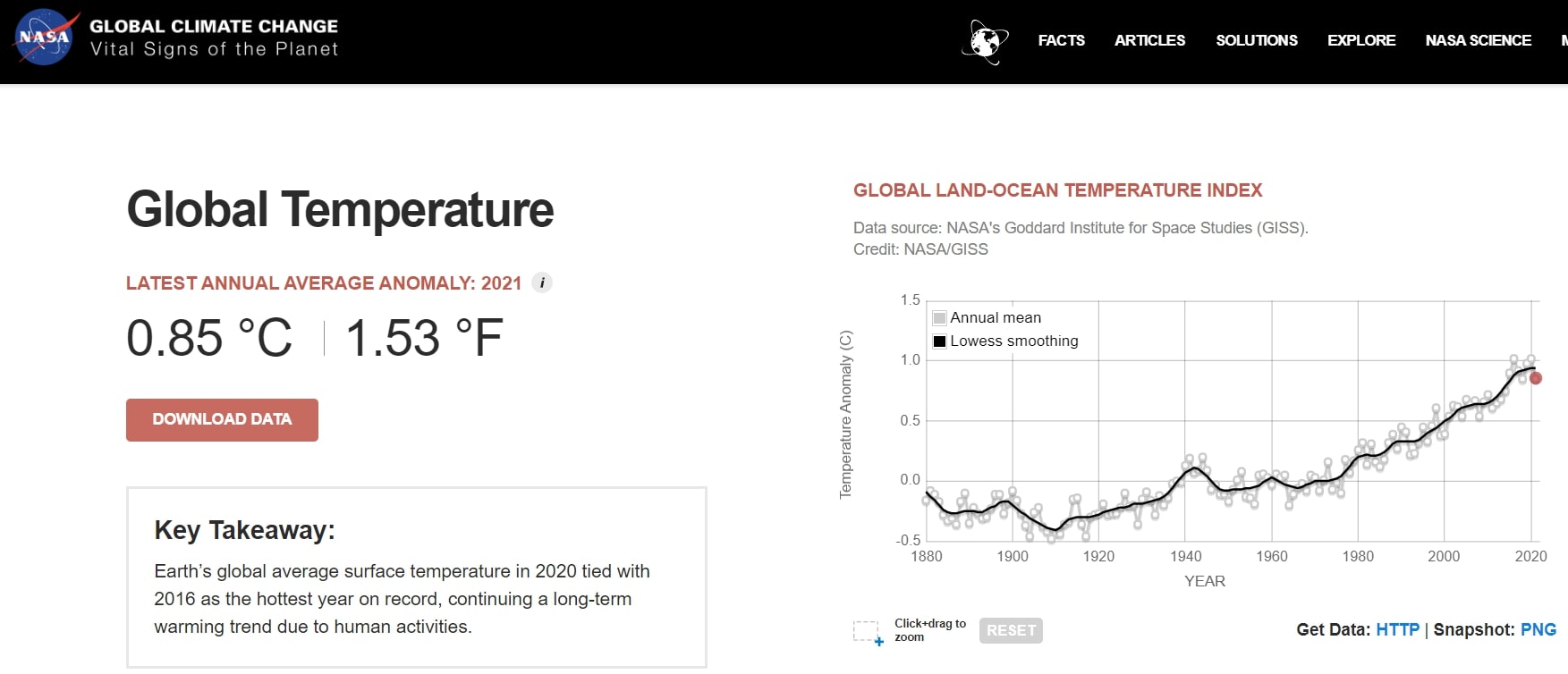
NASA’s Global Temperature Time Series best exemplifies this type of data visualization. It illustrates the gradual change in global surface temperature from 1884 to 2021, using a color gradient scale on the world map. The audience can simply use the slider to see the world’s temperature in a particular year.
Infographics
Lastly, are one of the most popular examples of data visualization. This method can be used to communicate complex data in a simple yet visually appealing way. If you want to share data about a product, company, or campaign, it’s best to do so using an infographic.
A great example of this is the Guardian’s visual guide about the Grenfell Tower fire. Instead of relying on text-heavy narrations to report the story, this infographic visualizes the events that took place during the fire.

Why Data Visualization is Important
When it comes to data, it can be tough to know where to start. Curating and understanding data is the key to spotting trends and making informed decisions, but this task can be difficult without some kind of visualization.
This is where data visualization comes in. This process takes data and puts it into a visual form that is easy to understand. This can be anything from a chart or graph to a simple table.
Data visualization is important because it can help you spot trends and correlations that you may not have been able to see in raw data. It also makes it easier to communicate data-driven insights to other people.
Moreover, data visualization can help boost your digital marketing campaigns by informing your decisions and helping you better understand your audience. This way, you can enhance your campaigns for better results. Some great examples of data visualization can be found in the world of digital marketing.
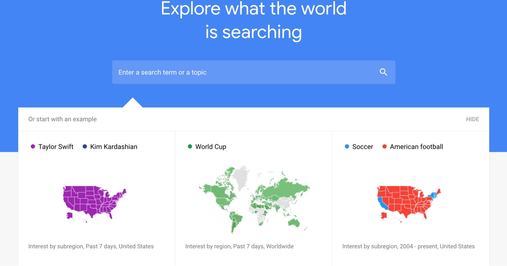
One of the best examples of data visualization is Google’s Trends tool. This tool allows you to see how often particular terms are searched for on Google. This can be used to track the popularity of a product, campaign, or topic. It also enables you to see how public opinion changes over time.
How to Choose the Right Type of Data Visualization
Understanding the different types of data visualization is essential for creating effective digital marketing campaigns. By choosing the right type of visualization, you can make your data easier to understand and more likely to influence your audience.
When it comes to data visualization, here are a few things to consider in order to choose the right type for your data and your message:
- Understand the data you’re working with. What is the story you’re trying to tell? What are the most important insights you want to communicate?
- Understand your audience. What do they already know about the topic? What do they care about? What do they find interesting?
- Think about the story you want to tell and the insights you want to communicate. Will you be comparing two things? Illustrating trends based on current events? Once you nail that down, you can begin to think about the best way to represent that data.
- Choose the type of data visualization that will communicate your insights best. After all, different types of data visualization communicate information in different ways, and it’s important to understand which type is best suited for your data.
How to Use Data Visualization in Marketing: Tips & Best Practices
Data visualization is an important part of digital marketing, as it can help you to see your data in a new way and discover trends that you may not have otherwise noticed. This can help you find new opportunities and predict outcomes.
Moreover, it’s a great way to communicate complex information quickly and effectively. By using graphs, charts, and other images, you can make data easy to understand and show the trends that are important to your marketing campaign.
Here are some tips for using data visualization in your marketing strategy:
Make sure your data is well organized and easy to understand.
Good data visualization begins with an organized set of data. After all, they will serve as the backbone for the content you’ll be making. If your data is messy or confusing, it will be hard to create a clear visual representation of it.
Choose the right type of data visualization for your needs.
Different types of data visualization communicate information in different ways. Some are more effective at showing comparisons, others are better at illustrating trends, and others are great for telling a story. There are a variety of different types of graphs and charts to choose from, so find one that will best illustrate your data.
For example, if you want to show trends in your data, it’s best to use charts and graphs. Meanwhile, infographics work best for explaining complex data in a more digestible way. You can also use animations to help you understand how your data changes over time.
Select the right software.
After choosing your data visualization method, it’s time to assemble your ideas into a cohesive visual. Part of successfully creating them lies in the tools you use. These tools help you build your storyline by depicting data in a graphical or pictorial form.
There are a number of different software options for data visualization, but many of them are expensive and require extensive training. If you’re on a budget or just starting out, there are a number of free or low-cost options that can be just as effective, such as the following:
Keep things clean and simple.
One of the most important aspects of data visualization is the design of your visual. It’s vital to make sure that your data is easy to understand in one glance. When creating data visualizations, simplicity reigns supreme.
For this reason, it’s best to use simple designs, clean lines, and avoid clutter. This way, you can communicate complex information in an easily digestible way.
Use color and font to emphasize the most important data points.
Colors and fonts play an integral role in visualizing your data, so make sure to use them to your advantage. They will help your audience understand the most important information straight away.
As a best practice, use colors and shapes to represent different data points. When doing so, try to select a different color for each data point. It’s also important to use fonts that make your data easy to read.
Be creative with your data visualization.
Lastly, you can use a variety of visualizations to help you see your data in different ways. By creating engaging and insightful visuals that represent your data, you can capture your audience’s attention and help them understand your message.
There are various methods to visualize data, so find one that will pique your audience’s interest. Some great examples found in digital marketing campaigns include the following:
- Netflix’s data-driven rebranding campaign
Each of these examples uses data in a creative and informative way, helping to engage the viewer and tell a story. By incorporating data visualization into your digital marketing campaigns, you can create more effective and engaging content that will resonate with your audience.
Conclusion
Data visualization is an important tool for understanding and acting on data. It can help you see the big picture, identify patterns and relationships, and discover insights that would be hidden in text-based data.
The seven examples shown in this article are a great starting point for anyone looking to boost their digital marketing campaigns with data visualization. But remember, the best data visualizations are the ones that are tailored to your specific needs and data. So experiment with different types of visualizations and see what works best for you.
The post 7 Best Data Visualization Examples to Boost Digital Marketing Campaigns appeared first on Mention.
Leave a Reply